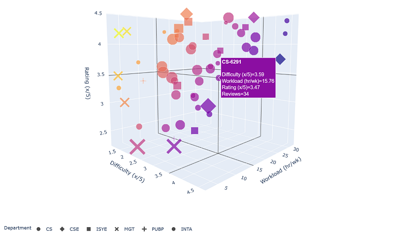
In this article, I show a tool I created to make planning for graduate college courses at Georgia Tech easier. The tool is accomplished by putting all dimensions of a popular review site into interactive plot that allows users to view all said dimensions at once. I also discuss some basic findings such as identifying easy or interesting departments.
Anyone who has taken courses in the OMSCS program at GT has probably used OMSCentral to help plan for their courses: it’s a site started by a former student that allows users to rate and post reviews about individual classes offered in the program. While I found it helpful in vetting individual classes, it was difficult to use when I wasn’t sure of what it was that I wanted to take in the first place.
For example: if I knew work was going to be busy in an upcoming semester, I might sort classes by least workload (hours per week), or maybe I would sort by most difficulty if I wanted to learn some hard skills a little more permanently. I would prefer to only look at the “highest rated” courses in each category, but this can be a little tricky to balance and reviews aren’t always trustworthy especially when only a few people have rated the course. Additionally, you must be careful to not take too many non-CS courses to still qualify to graduate.
To ameliorate this problem of balancing constraints, I decided an interactive plot in all rated dimensions would be ideal. Furthermore, this plot should display the course departments and popularity at the same time while also having a way to look at individual reviews quickly. A great tool to do this ended up being Plotly, which I had learned about from a colleague during my time at General Motors. It’s a Python package that lets you build a wide variety of interactive plots and display them as a webpage. You can see the final plot I built separately on Figure 1 (or here). The tool is a little beefy to render due to the huge amounts of minified JavaScript that gets generated – one of the downsides of the package.

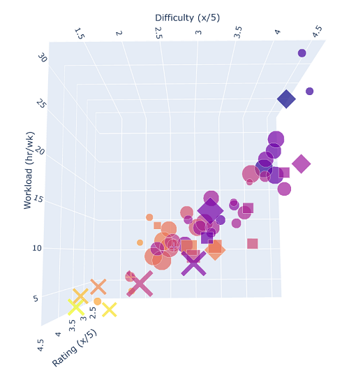
A couple takeaways when first looking at all this data in 3D was that management courses seemed easy (none of them being over 3/5 in difficulty) and that highest rated classes tended to be in industrial systems and engineering (despite an average workload). If nothing else, you can see on Figure 2 that difficulty and workload are almost perfectly correlated, which means prospective students can probably just ignore one or other. By now, the data I used is probably out of date since I made the tool in 2021 to charter the rest of my courses. If someone wanted to use it in the current year, I’d suggest grabbing a copy of the code from here then updating the data file with something more current before rebuilding a new plot.
